Precision Timing in Human-Robot Interaction: Coordination of Head Movement and Utterance

Related comments:

Summary:
Yamazaki, et. al, a team of researchers from Future University-Hakodate and Saitama University, discuss the affect significance of non-verbal actions by robots when conversing with human partners.  Previous research had indicated the importance of non-verbal actions in human-robot communications, but Yamazaki, et. al aimed to show that the timing of such actions is also important.  They conducted preliminary experiments with museum guide robots in which they robots either turned their head toward a visitor while talking about an exhibit, or they continued looking straight at the exhibit.  They believed that visitors were likely to look at the robot if the robot looked at the visitors.  They took things a step further in the next experiment, where robots performed either in systematic mode (turned head to visitor at interactionally significant cues) or unsystematic mode (turned head to visitor at interactionally insignificant cues). 
In the main experiment of the study, the researchers studied 46 participants who were shown a display in a museum by a guide robot (pictured above).  What they found was that participants showed synchronized responses to the robot in systematic mode, often turning their heads at the same time as the robot.  The robots in unsystematic mode, however, elicited fewer responses from the visitors and were much less smooth in communication.  

Discussion:
It's very interesting to me how easily people begin to interact with the robot in a more natural way when it turns its head at the appropriate cues - it displays how important non-verbal communication really is and how simple changes to robots or other interaction systems can make dealing with them so much smoother.  The researchers mentioned that visitors would often stop paying attention to the robot's explanation of an exhibit if it seemed that the robot was not turning toward them at the appropriate cues, but were more engaged when the robot looked at them at important points in the explanation.  The research still doesn't explain why Japanese people seem to be obsessed with robots, but it does indicate that we can make them more interactive with the appropriate timing of non-verbal cues.

Building Mashups By Example

Related comments:

Summary:
Rattapoom Tuchinda, Pedro Szekely and Craig Knoblock of the University of Southern California's Information Science Institute present their research on building internet mashups in this paper.  A mashup is a web application that integrates data from multiple web sources to provide a unique service.  Many tools exist for creating mashups that ostensibly accommodate non-programmers, relying on things like widget controls to execute their functions, but these tools are usually confusing or do in fact rely on the user's understanding of programming concepts in order to function.  The authors briefly discussed several existing tools and the main issues of creating mashups - data retrieval, source modeling, data cleaning, data integration, and data visualization.  They then presented their own mashup builder, Karma, which they posited would solve the problems with other mashup-creation tools.
Basically, users can drag data from the browser on the left into the table on the right to "extract" it, after which Karma will help them assign attribute names, clean and integrate the data.  The authors discussed the implementation of each step of the process as realized by  Karma in detail.  They held an evaluation comparing Karma to mashup tools Dapper and Pipes to see if it made mashup creation easier and faster; an expert was tasked with carrying out three mashup building tasks and the researchers tallied how many "steps" the user took for each process in the task.  Overall, Karma outperformed the other two systems, consistently taking fewer steps to achieve the same results.

Discussion:
I have to be honest: after reading this paper and even looking at a few examples cited by the authors, I still can't really tell what a mashup is or what its purpose might be.  All of the things I saw looked like spruced-up RSS feeds or link dumps...maybe that's what a mashup is supposed to accomplish?  Karma certainly seemed up to the task of creating one, I guess, but it didn't help me figure out what a mashup was.  I even went to MashupCamp to see what all the fuss was about, and the first sentence I read in their about page said, "Ask 10 self-proclaimed mashup developers what a mashup is and you might get 10 different answers."  Thanks for the illumination, MashupCamp.

Tagsplanations: Explaining Recommendations Using Tags

Related comments:

Summary:
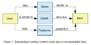
In this paper, Jesse Vig, Shilad Sen, and John Riedl from University of Minnesota's Grouplens Research present Tagsplanations, a system of explaining system recommendations based on community tags.  Popular media services like Netflix or iTunes often have recommender systems that suggest similar items based on the user's previous selections or perceived "tastes."  The researchers first discuss the most common method of recommendation - establishing an "intermediary entity" between the user and the item to be recommended.  This is the typical model of an intermediary entity:
 Tagsplanations uses tags to establish this intermediary.  For example, “We recommend the movie Fargo because it is tagged with quirky and you have enjoyed other movies tagged with quirky.”  They aim to provide the user more information about why a user might like a recommendation.  It uses several features like tag preference, relevance, and filtering to increase the overall quality of the tags.  

The researchers conducted a user study in which participants tested Tagsplanations in four different interfaces and filled out a survey about their experience.  80% of the subjects found that the system helped them understand recommendations better and make a selection decision.

Discussion:
From my experience with Netflix, I know that tagging and recommendation systems can help a user discover new media that they otherwise might not have come across.  I think Tagsplanations is a great way to bolster current recommendation systems and help users make decisions about what they want to see.  The specific tags are a lot better than a vague "you might also like this" statement.

Opening Skinner's Box

Opening Skinner's Box by Lauren Slater was at once entertaining, fascinating, horrifying, disorienting, and just plain weird.  It was refreshing to read a book that was packed with information rather than acidic complaints about design or software.  Slater dispenses history and commentary in an accessible narrative style that belies the profound observations about the human psyche made by the discussed researchers.  However, some of her more personal and colorful remarks (as well as her tendency to try and replicate some of the experiments from the book) undermined my confidence in her as a reliable narrator.  I found her thoughts about each experiment useful, though, as they often echoed or contrasted my own.

Slater gives a brief historical synopsis of each experiment (the full list of which I'll put below) and the responses or controversy generated by it; she often interweaves personal narrative or vivid analogies with facts which, while making the book more interesting as a whole, are sometimes off-putting or detrimental to the reader.

Slater discusses ten important psychological researchers and their experiments: B.F. Skinner and his work on behaviorism; Stanley Milgram's authority experiment; David Rosenhan's skewering of psychiatric diagnosis; Harry Harlow's brutal look at love; Bruce Alexander's Rat Park, Elizabeth Loftus' work with false memories; Antonio Moniz and his most famous creation, lobotomy; Latane and Darley's discovery of diffusion of responsibility; and Eric Kandel, whose work showed the brain chemistry behind learning.  Each of these experiments is fascinating in its own right, and having them all together in one place makes them that much easier to compare and discuss.

I enjoyed reading this book, though I was cautious to accept many of the things Slater said in it.  Several interviewees in the book later claimed to have been misquoted and Slater's own sanity is called into question several times by the things she says and does.  Personally, I thought that made the book more interesting - I would have enjoyed a dusty academic fact-roll far less than I enjoyed Opening Skinner's Box.

MediaGLOW: Organizing Photos in a Graph-based Workspace

Related comments:


Summary:
This short paper from IUI 2008 by Girgensohn, et al. presents MediaGLOW (Graph Layout Organizing Workspace), a photo-browsing system that groups user photos and displays them via a graph-based layout algorithm that places items in stacks and local neighborhoods.  MediaGLOW maintains a graph representing similarity distances between photos and photo stacks (nodes).  Similarity distances connect nodes like springs and assign weights as appropriate.  These distance values can be calculated in a number of ways - photo creation time, geographic location, and visual similarity.  Once the user groups photos into a stack, the stack is surrounded by a "neighborhood" of similar photos.  The neighborhoods are represented by "halos" that show up "hot" (red) or "cold" (blue) based on how strongly related they are.  


The authors conducted a user study of MediaGLOW in which participants were given 450 geo-tagged photos and asked to place them into five categories, then choose three photos from each category to place into a travelogue.  The overall results showed that traditional interfaces were more efficient for the task than MediaGLOW, but that MediaGLOW was more "fun" to use.


Discussion:
MediaGLOW does a good job of visually associating photos and seems like a fun way to navigate a photo library.  The problem with it (for me) is that the layout would get confusing and cluttered very quickly as the number of photos in the library increased.  When combined with some sort of touch interface, I think MediaGLOW could be a very powerful tool for photo browsing and organization.

Detecting and Correcting User Activity Switches: Algorithms and Interfaces

Related comments:

Summary:
In this paper from Oregon State University’s School of EECS, authors Jianqing Shen, et al. present an updated version of an interface they had previously designed to detect and catalog switches in user activity, called TaskTracerTaskTracer applies machine learning methods to associate sets of resources with a particular user activity and make those resources more readily available to the user.  In this context, the term resources include documents, folders, email messages, contacts, and web pages.  TaskTracer configures the desktop in several ways to make these resources easy to get to: the task explorer presents a unified view of all resources associated with the current activity; the folder predictor modifies the Windows Open/Save dialogs by defaulting to folders associated with the current activity and adding shortcuts to them; the system has a time reporting feature that allows the user to show how much time was spent on each activity in a given period; finally, TaskTracer automatically tags incoming and outgoing emails associated with the activity.  The first version of TaskTracer had several problems including incorrect associations, unnecessary interruption of users with dialog boxes, and very slow learning algorithms.  TaskTracer2 fixes these issues by implementing an improved association engine, a desktop state estimator, a more intelligent switch detector, a notification controller that minimizes user interruption cost, and a clearer two-panel UI.

The researchers conducted a study on two people, a “power user” who recorded 4 months of data, and a second user who used the system for 6 days.  Overall, the participants found TaskTracer2 to rarely make an incorrect prediction, though it didn’t always make the exact correct one.

Discussion:
I think the user study for this application speaks the most clearly in regards to how I feel about TaskTracer: the “power user” found it very useful and accurate and was even described by the researchers as “fairly careful about declaring switches.”  I think associating resources with particular tasks is a great idea (like a more powerful, dynamic version of Windows’ “Recent Documents” feature), but having to explicitly declare when I’m switching activities would annoy me very quickly, especially if the system started pestering me about it with dialog boxes.  I think TaskTracer is best suited to the sort of conscientious power users that the researchers studied; the average user probably wouldn’t reap enough benefit for all the explicit task-switch declaration to be worth it.

The Inmates Are Running the Asylum (Chapters 8-14)

I think it's safe to say that Alan Cooper's tone softens somewhat in the second half of this book.  While the first seven chapters concerned themselves primarily with calling out the hubris and generally dickish behavior of programmers, the latter seven offered constructive suggestions and real-world examples of how to fix the problems present in the software industry.  It was refreshing to see solutions offered to balance out all the acidic complaining.  His concept of developing for "personas" rather than the generic "user" has a lot of merit - I even found myself using this process with my project team when developing our sketch application.

As I stated in my summary of the first seven chapters, I think a lot of the things Cooper has to say in this book lack the impact in 2010 that they had in 1999 largely because so much of it is part of the industry now.  Companies do focus on interaction design.  Programmers aren't the huge jocks they used to be (at least not to as large a degree).  The software we have now is better than what we used to make.  Is some of it still dancing bearware?  Probably.  I don't think that kind of software will ever completely disappear.  However, I think it's safe to say at this point that (forgive me) the inmates are no longer running the asylum.